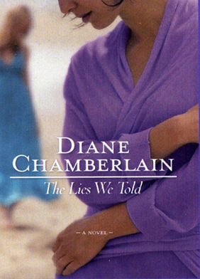
Sneak Peek at the Cover of The Lies We Told

The cover for The Lies We Told, which I just completed and which will be published June 2010. I love it, but the hair color of the sisters doesn’t match the story exactly. How much would that bother you as readers? If I view the image as more representational than literal, I can get past that fact. . .
I like the cover a lot I generally like for the cover to ‘match’ or be near to how the characters are described as looking. I usually find myself picturing the character exactly as how they appear on the cover.
Love the cover Diane but I have to be honest and tell you that if hair color or other items are different from the story, it bothers me. It should be just as easy to have a model with the right hair color on the front than to have the wrong one. Otherwise, I love it.
Yep, I’m in agreement with Denise and Margo too.
I agree with all of you. However, as we’ve discussed here before, the author doesn’t have much clout (unless he’s a Grisham or she’s a Roberts). 🙁
In that case Diane, it doesn’t bother me in the least!
Not to worry Diane. We’re gonna read your books anyway.
:-))
Agreeing with Gina, of course I’ll read your books Diane…I wouldn’t have even given my opinion but you asked and I am one that notices and pays attention to book covers.
But regardless of the photo or painting on the front, what counts is the written page and Diane always gives an unforgettable novel that keeps me focused on the story and characters…in Brenda’s words ‘Diane never disappoints’
I don’t think it matters at all whether the cover matches the characters in the story. It doesn’t take anything away from the content of the story. I honestly can say I rarely look at the cover when I read the story. I only look at the cover to identify the Chamberlain book.
That was suppose to read Sammie Crain, not Sannue Craub
I’ll repeat the message: I don’t think the cover matters when I read the story. I rarely look at the cover when I’m reading the content. I think all the covers are very attractive. However, I forget all about it when I’m engrossed in the book.
I’m glad y’all will read my novels, regardless of haircolor! As my editor pointed out, the colors ARE accurate. It’s just that the character I see as the central person in the story is the blond, and she’s in the background. I think I need to just relax!
Breathe, Diane, breathe.
Oh, that makes a difference Diane…as a ‘cover’ person, I’m glad to know the colors ARE accurate, even if the main character is in the background…I don’t think that part will bother me, as long as she’s in the picture…and with the correct hair color thank goodness!!
Diane…no worries…this is going to be an incredible story and I CAN HARDLY WAIT!!…let’s see, we only have 8 months till release date…
Hey, Sannue Craub, welcome to the blog! LOL.
It doesn’t ‘bother’ me exactly but it would generally make me think that there wasn’t much collaboration between author and designers. I’d suppose the publishers arrange the design without reading the book? Maybe very literal of me, but I would prefer if the cover showed two red heads if the women in the story have red hair…
I just hope it’s available in the UK, never MIND the cover to be honest!!
Susie, I’m going to answer this is a new blog post. Thanks for the comment!
I love the cover-I could care less about the hair color. I don’t pay attention to the people on the cover ever…just love the colors you are using…great…great…Relax and don’t worry about the hair color. When I read your books, I never remember those things-the physical characteristics…Can’t you see someone trying to make an accurate cover for CRIME AND PUNISHMENT or GONE WITH THE WIND????
I hope this email gets through-I usually hesitate to compare writers…but those “someone mentioned”–you are far greater–that is my opinion…you should have the FINAL say on your cover…but in this instance, it is not a real worry…
We are off to Topsail Island in the am, for our first stay at the condo. I’ll post from there as soon as I get a chance! Thanks, all for the cover feedback.