The Fire and Rain E-Book Needs a Cover!
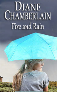
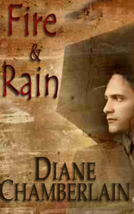
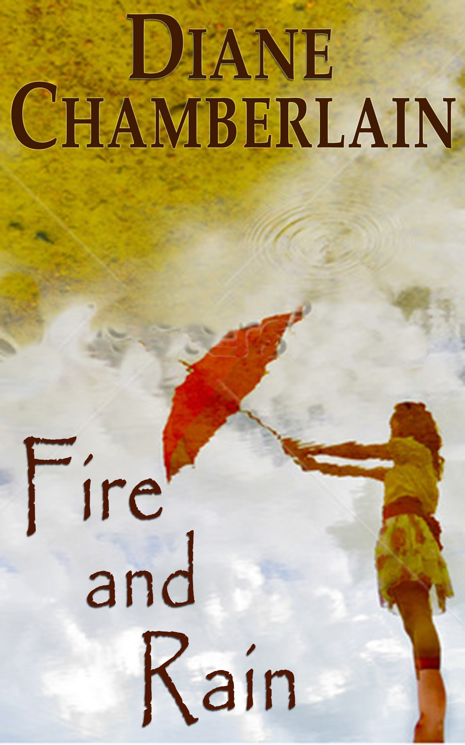
I’m working on my out of print book, Fire and Rain, editing and formatting it to join the other older books I’ve put up as ebooks. Fire and Rain is the story of a small drought-ridden town in San Diego County, where buildings are burning and crops are dying. A stranger comes to town, promising he can make it rain if he’s given a place to live and no one asks him any questions about himself. It’s a fairly serious book, part love story, part mystery, and I’m looking forward to putting it out in the world again. But it needs a cover! These are all rough ideas made from comp (blurry) images, and the fonts etc can all be changed. Let me know if any of these would appeal to you. (note on the upside down cover: I created the right-side up one, but one of my Facebook friends, Cynthia Moyer, realized the image was actually a reflection and turned it “wrong-side up”, so I have both of them here for you to consider.) Thanks for your help!
A.
————————-
B.
———————————-
C.
——————————————
D.
————————————
E.


I don’t think any of these images works, but that’s just my lousy 2 cents. I’d like to see Diane Chamberlain in bigger type than the cover, and the title in similar font. The image is not so important (most of these distract from the book). At least you don’t have adirondack chairs on a beach. I am so sick of that image. Make this book about DC. She is the comfort zone. “Oh, a Diane Chamberlain novel – yes, that will make me happy for the next several hours.” The cover should sell that. Someone once told me something along the lines of, If you don’t promote yourself, no one else will. I don’t think those were the exact words but you get the point. Make this book A DIANE CHAMBERLAIN NOVEL and feed it to people like they can’t live without HER. That’s what a cover should convey.
c
I actually prefer the original cover on the book. The cactus, the stucco or adobe house give a real feel for the area.
I choose A…the photo looks exactly how I pictured the artist ‘Mia’
I’m going with A, it falls in line with the rest of your re-releases. Maybe add a bit of flames in the background? I vividly remember reading this book but for the life of me can’t remember how it ends! I see a re-read in my future 🙂
I like A best. Love the idea of the reflection, but it’s too confusing either way. A looks more like your other covers, too. Good luck.
Diane I like B it just felt right to me with what you wrote about the book. Keep up the good work.
I like B.
I like D!!!
I vote A
I like B…
Jeffrey, it is so hard to make Chamberlain big! Believe me, I’ve tried. Cover A is most in keeping with the “branding” that my publisher has given me and looks very much like “a Diane Chamberlain.” The others are really different from my typical covers. I’m personally leaning toward A, although my character has short hair. . .
Ann, I can’t use any part of the real cover, which I actually wasn’t crazy about anyway except for the adobe. An adobe would be a nice touch here.
I like C!
Hi everyone,
I vote for A and can’t wait to read it. I have been unable to find your older books I m very happy that you’re making them available as e-book. Thank you Diane you’re such a wonderful author. All the books that I read so far (about 7) are all in my favorites book.
I think A is the clear winner of this batch, though Jeffrey might be right that none of them will work. I really like A, but it presents a real problem for me, because Mia, the character on the cover, has short blond hair. She’s only 29, but she’s recovering from chemotherapy after breast cancer. I can shorten the woman’s hair, but I can’t easily recreate her shoulder which will show once the pony tail is gone! I think I’ll put this cover on the back burner for a week or so. Thanks for your input. More is always welcome!
I vote A. Will it come out soon?
I did not love original cover
Isn’t the book about a man
Jeff??? Why a woman ??
I love A!!
Brenda, I always think of it as Mia’s story. Yes, it’s about Jeff, but we’re never in his point of view. We’re in Mia’s head, Carmen’s head and Chris’s head. To me, Mia was most significant. As a matter of fact, Cosmopolitan Magazine did a condensation of the book and their focus was all on Mia (way too MUCH on Mia, really!) But I’d be fine with Jeff on the cover. . .
Shari, I predict it will be available as an ebook in 2-3 weeks. I hope.
Am rereading it now
I do not think these covers work for early 1990’s
I have always enjoyed this book
Diane-what about the title for new book?????
Still waiting to hear, Brenda!
I really like B Diane. the cover would lure me into reading it(even though I already have and loved it)
C is the best! Can’t wait to read it.