Voting Time Again!
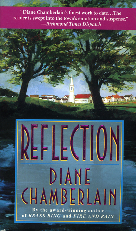 I’m working on the e-book cover for my backlist novel, Reflection. (That’s the original cover on the left.). Reflection is the story of Rachel Huber, a woman in her early forties who returns to the Pennsylvania Dutch town (Reflection) where she grew up to take care of her grandmother. Rachel fled from the town twenty years earlier after a tragedy for which the townspeople still blame her. Now, she develops a strong relationship with her grandmother (who has a bunch of secrets. . . ) as well as with the man she was once in love with (who is now married and a Mennonite minister. . . ), and everyone still hates her. Clearly Rachel has some problems to deal with! (She also has dark hair, but I can fix the blondes in the photos).
There are a lot of images here and I’m trying to narrow down the field, so feel free to pick your favorite one, two or three. These are just “comp” images, so they are small and blurry, but you get the idea.
Thanks for your help!
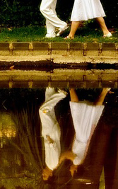
A.
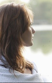
B.
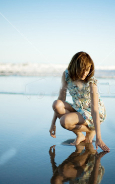
C. (note–there is no ocean in this story, but there is a pond, so I’d have to change the background a bit)
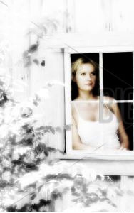
D.

E.

F.

G.

H.

I.
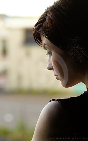
J. (ignore the swirl on her face. That’s just part of the comp image).
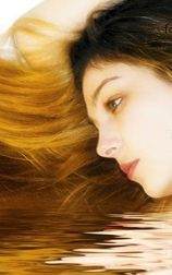
K.
G or H are my picks!
A and J
I like H or J
If they were all in a bookstore, I’d pick up the one with the window first. They others have too much negative space. I am so attached to great book covers. The only book I loved, but hated the cover was Mr. Rosenblum dreams in English. The next book on the list of good books with bad jackets is Major Pettigrew’s Last Stand. Both terrific books , but bad design. Hope this helps you. Just read Solomon’s Oak, it was great, it made me cry. But I don’t know who the blonde is on the cover, I assume it’s Cassie, but it’s more Juniper and Glory’s story. Some times you have to wonder if the artist really read the book
I like E….the girl in the wheat field. her hair is kind of funky, but you could probably fix that. Sort of evokes the feeling of the book as you described it.
Just my two cents
B resonates the most for me, thanks for asking 🙂
G is my fave!
H, E, D — in that order.
G,H,E…in that order
D and G!
G,E, or H. They fit in with your look.
E or G
C is my favorite (assuming the background can be changed), followed closely by D. A is also very nice, but it doesn’t sound like the relationship with the ex-boyfriend is the main focus of the story.
Funny how people choose different covers. For me it’s absolutely A. None of the others work for me.
You’re the only A vote so far, Mary, here and on Facebook, which only means you are unique! I like it too, but it might be too light for this book. Maybe you like lighter stories?
H is my pick!
I pick E reminds me of pa
Mary Connolly, the artist rarely does read the book. The covers are created by a combination of marketing, editorial and art departments and they try to create something that fits the book but more importantly, they want a cover that will cause a reader to pick the book up. That’s why the covers sometimes don’t seem to fit the book at all.
i like G and E. I am wondering though about the significance of the word “Reflection”. If that is more than just the name of a town then I think that theme should be reflected in the cover. If you put B in front of a mirror or other reflecting device, it would work for me. I know you can’t judge a book by its cover,(LOL) but the cover should inform the reader a bit about the book. The old cover provides a rural pastoral scene with the church at the center. From that, I can infer a bit about the setting. Cover I might work if there were a tiny church or something else that would convey the unique Penn-Dutch setting in the background.
Rose, I thought about tying in a church to the cover, but I’m afraid of conveying the idea that it’s an “inspirational” or Christian novel. One thing I’m trying to do with these ebook covers is continue the look my publisher has going for me with my latest covers–that is, very “people-centric” instead of “landscapey.” I searched for a little Penn-Dutch village photo, but there was nothing that worked very well.
I like A and I.
i understand Diane.
A because the ‘reflection’ is so interesting (and lovely), but I also like E because it reminds me of PA. The woman in D looks as if she is mulling over her problems, which seems a good fit for the story.
I love J. I am reading this book now–40 or so pages to go and I can hardly put it down! Love your books. Just have 2 more to go before I will have read them all and I’m going to be so sad! I need to find an author to go to next. Any suggestions? 🙂
Am I the only one who likes ‘K’???…that’s my pick.
G and J. You’re good!
margo, I bet you like K because the woman has long hair like yours. 🙂
Kristina, for another author to read, you can’t do better than the last commenter, Emilie Richards. She’s a fabulous author and one of my best friends. i’m glad you’re enjoying Reflection.
LOL!!!!!!!!!!!!!!…maybe you’re right! (-O:
D. Reflection on the glass
Looking forward and back