I Need Your Help Again!

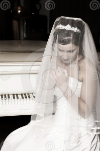
 As I mentioned a while back, I plan to have the covers of my backlist e-books redesigned. I’d love it if you could help me with some decisions along the way. Here’s the first choice I have to make for my book Reflection. Which cover appeals to you the most? Left or Right? (Try to ignore the watermark on the one on the right; it’s only a comp). If you think of it, tell me what country you live in, too. Thanks for your help!
The one on the right is much more in line with your other covers. The light in the background of the one on the left in weird. I think the one on the right is the most relfective. The one on the right is just more appealing.
USA
Okay…apparently I don’t know my lfet from my right…the one on the left is best!! Sorry.
I like the one on the right. It has more specific detail, the piano, the bride. My curiosity is aroused because I want to know what they have to do with each other and why the bride looks unhappy. The one on the left is attractive, but more generic. It doesn’t really suggest anything to me. I’m from the US.
I like the picture on the right had side, but then does the book have something to do with weddings. I have not read this one so not really sure. The USA
Definitely the left. It’s lovely and looks like your latest covers. The right is so busy I couldn’t decide what I was supposed to focus on – the piano or the bride. Also dislike her wedding hair, which doesn’t look at all modern, imo.
I like the one on the left, it looks like she is reflecting on something.
I am a photographer so I’m really picky so I apologize in advance 😉
The one on the left I like the idea of but not the execution of it. I want to see more of her face and the one on the right is just too busy and IMHO not very ‘reflective.’ However the pose and the mood is more along the lines of what I think of with this novel.
Your other novels tend to either show an idea or a person but always everything is well lit and colorful, both of these fall a bit flat compared what I love about your covers.
Left…
Definitely the one on the left by a wide margin. The bride on the right looks old-fashioned and melodramatic. Photo too busy as well. Not that I’m opinionated or anything.
I prefer the one on the left. It is more in line with the book, in my opinion. As others have said, the one on the right seems too busy.
I’m from the United States.
They are both lovely, Diane. The left one, however, appeals to me the most. Perhaps because it leaves more open to the imagination or that is simply seems more modern.
Personally, I like the one on the left. Looks more like someone who is reflecting on life. Kind of studious, too.
Left.
The left!
Left – because it says a lot without distraction. My country is USA.
The left. From NY, USA.
the one on the left draws you into the picture. the bride just makes you want to run. she looks too needy right now.
Corey Ann, I live with a photographer so I’m used to lots of opinions! lol.
Very interesting responses. The bride IS from the grandmother’s part of the story–not contemporary–but she’s clearly confusing things for the viewer.
I love the one on the left, I think it is interesting.
The one on the LEFT is a sure thing! USA
I would like the one on the right more if it was in softer focus. I think it arouses more curiousity than the one on the left.
While I agree that the one on the left looks more in line with your recent covers, I like the one on the right better.
-Samantha
Connecticut, USA!
Left
Piqua, Ohio, USA
I prefer the one on the left.
USA
Left
N.C., USA
The one on the left. From France
The one on the Left!!
Uk
Both are lovely but think the one on the left fits in with your other covers better, also makes you feel like there is a story there but you’re not sure what, you’ll have to read the book to find out !
Im in Ireland 🙂
I like the left one. Seems to speak volumes and is timeless for me. I have to say that it’s early morning here and I am sipping coffee and thinking in song. Here’s what my head is singing this morning when I saw your post.
The one on the right was on the left
And the one in the middle was on the right
And the one on the left was in the middle
And the guy in the rear was a Methodist
Jonny Cash.
I think I need another cup:}
Left – unless the one on the right has a specific meaning to the book?
The one on the left – e-books, in my opinion, speak in contemporary! USA
Left – NY – USA I loved that book just like I have loved all you books!
Left
Sherry, LOL!
Martha, perhaps you’re right. The reason I asked about country, by the way, is because this book is my best seller in the UK and my slowest seller in the US, so I wondered if there would be a big difference in your answers, but doesn’t look like it.
The one on the left
Sorry, hon, but I’d keep looking. Neither of these is particularly eye-catching or attention grabbing, especially in thumb size (mostly for lack of color–they’d just kinda disappear).
I know, I know: it takes hours–days, really, and sometimes weeks–to rummage through stock photos at three or four different sites, and a lot of times, nothing looks like what you really want. Still, I’d keep looking.
Or . . . I’d get that guy of yours to stage a shoot so you end up with exactly what you want (or, maybe, what “marketing” says is going to sell the book).
I don’t know, Mary. That cover has sold more than 12,000 ebook copies of Reflection in the last year, so I’m hesitant to tamper with success! I think my other covers are in more dire need of change than this one, but we’ll see…
If you don’t want to tamper with it, then why are you asking? Because of the difference in UK and US sales? If that’s so, then the answer has to do with the differences in cultural appeal, in which case the question isn’t, Which is these pictures do you like better? It’s, What kind of artwork would attract both to UK and US readers? Clearly, you’ve already got one that attracts UK readers; I’d call it quiet, low-key, inward-looking (i.e., reflective). My guess is, US readers would be attracted more to something that’s jazzier, bolder, more colorful, “louder,” etc. So the real issue is, can you find a happy medium? Or do you want to simply leave it be…?
Looking at all the other covers, it doesn’t surprise me a bit that the current cover hasn’t done as well as the others in the US. With the exception of Kiss River (which I do think could stand a redo), the others are all more visually interesting–more colorful, more active–as I said, jazzier. And your publishers’ covers are even more so (no clue how they’re selling, but they really are pretty wonderful covers–I esp. like the “Keeper” one).
If you do decide to change the REF cover, you might look at the TLWT and TSSLB–both women in “reflection” mode, both “quiet,” but with more going on visually than the successful-in-the-UK REF cover.
Dunno. Just imo.
Mary, my goal is to have my 5 e-pubbed backlist books have a consistent look and design, which they don’t have at this time. That’s why I’m exploring options. I think you looked at the backlist on the Books page on my website and some of the backlist there are the old publisher covers (the dreary Kiss River, for example). If you click on those books, you’ll go to the five ones I put up. Kiss River is being reissued on the 22nd, by the way, and has a beautiful new cover, so it will be removed from this backlist section very soon. This really gets complicated! I appreciate the input.
The photo on the left. In my opinion, it is wistfully soul searching!
Left!!!!!
I prefer the one on the left. This one to me is more reflective, and the hint of colour gives a little bit of warmth to make me want to know what the story is about. The picture of the bride is cold, dull and does not inspire me to find out if she has a big old cold/flu on her wedding day or has much bigger fish to fry! I am from the UK. Love the new website.
Alicia, thanks for the laugh!
I like the one on the right–looks like the inside of the book will be more thought-provoking. While the one on the right looks like more of a “romance type” novel. One comment about the one on the left, the faded back building looks like the “White House.” Maybe that should be changed?
Thanks for your great books, Diane!
Oh, dear, I, too, meant I like the book on the LEFT!
This Canadian loves the one on the left. The visual screams “reflection” without even reading the title! Can’t wait for your next book, I have read them all!!
The left, hands down!
From Ontario, Canada
The one on the left for sure! For a book of today, it has a much more updated look. The one on the left reminds me of a romance novel.
From Wilmington, NC & NY
I like the one one the left… We had a little pole round the office and left came top 7 /10
love the new web site. x x
Dawn, maybe I should use your office as my focus group in the future! Thanks for the input, everyone.